Are grey kitchen cabinets still in style for 2026? The short answer: yes, but the version of grey that ages well looks nothing like the cool steel cabinets that flooded showrooms in 2018. The 2026 grey is warmer, softer, and almost always paired with another tone. If you are planning a kitchen renovation in Mississauga this year, the question is not whether to use grey. It is which shade and how to keep it from looking dated five years from now.
Designers, real estate agents, and homeowners all agree on one thing: grey is no longer a trend. It is a foundation colour. What changed is everything around it.
Quick take
Grey kitchen cabinets are still in style for 2026, but only when the shade is warm enough to read as a neutral. Cool steel greys are out. Soft warm greys, greige, and mid-tone slate are the 2026 picks. Two-tone schemes pairing grey with warm white, walnut, or natural oak look the most current.
Why Grey Stayed When Other Trends Faded
Most kitchen colours have a clear shelf life. Cherry-stained cabinets dominated the early 2000s and dated quickly. Espresso brown peaked around 2010 and now reads heavy. White cabinets had a long run, starting around 2014, and they are still common, but pure white is starting to feel sterile to many homeowners. So why has grey survived?
Two reasons. First, grey is not actually a colour in the way cherry or espresso is. It is a neutral, like white or black. Neutrals do not go out of style. They get reinterpreted. The grey of 2018 was cool, almost blue. The grey of 2026 has more warmth and depth. Same family, very different feel.
Second, grey hides daily wear better than white and shows fewer fingerprints. In a working family kitchen across Oakville or Mississauga, that matters. White cabinets need wiping down constantly. Grey looks clean longer.
The Grey Kitchen Cabinet Shades That Work in 2026
Not all greys age the same. Pull a paint deck and you will see hundreds of options. Six categories cover almost every 2026 kitchen we are designing, and the differences between them are worth understanding before you commit.
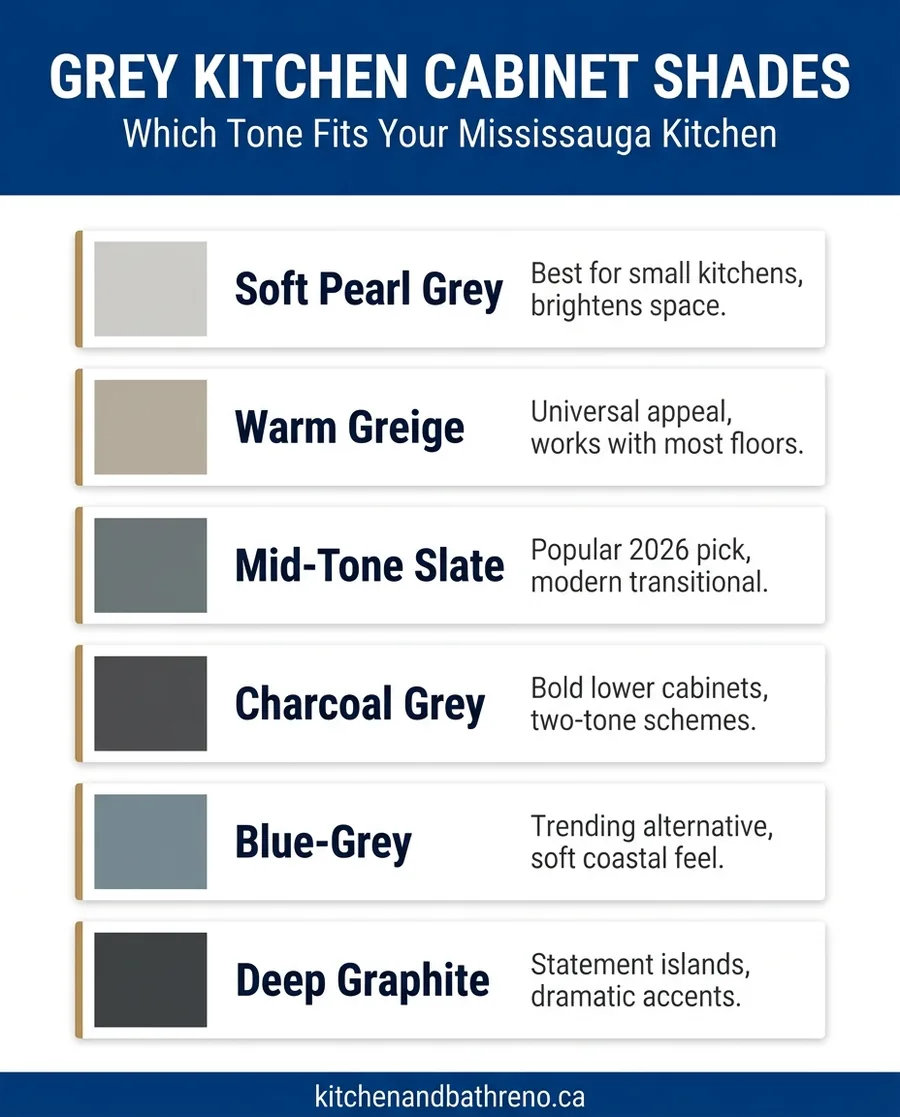
Soft pearl grey. The lightest end of the spectrum, with a warm undertone that almost reads as off-white. It works best in compact kitchens or rooms that face north and need to feel brighter. Pair with warm white walls and natural oak floors. Sherwin-Williams Repose Grey and Benjamin Moore Edgecomb Grey are anchor examples.
Warm greige. The most universally flattering grey for cabinets. It has enough beige to feel cozy, enough grey to feel modern. It hides scuffs and pairs with almost any countertop and floor. Benjamin Moore Revere Pewter remains the reference colour, even nearly two decades after release. If you are uncertain about which grey to pick, this is the safest choice.
Mid-tone slate. The 2026 designer pick. It has enough depth to feel sophisticated without going dark. The undertone is balanced, neither obviously warm nor cool, which makes it forgiving in different lighting conditions. Sherwin-Williams Mindful Grey and Farrow and Ball Lamp Room Grey both fall here.
Did you know?
The undertone of grey paint shifts dramatically depending on the lighting. A grey that looks warm under showroom lights can read cold under LED pot lights. Always view a sample in your actual kitchen, at the time of day you use the room most, before signing off.
Charcoal grey. Best used on lower cabinets in a two-tone scheme, or as an island accent. It adds drama without painting yourself into a corner. Avoid using charcoal on every cabinet in a small kitchen. The room will feel like a cave by year three.
Blue-grey. A trending alternative for homeowners who want something a little different. It reads softer than charcoal and gives the kitchen a coastal or Hamptons-inspired feel. Benjamin Moore Coventry Grey and Farrow and Ball Plummett are popular picks. Pairs well with white quartz countertops and brushed brass.
Deep graphite. Reserved for statement pieces. A graphite island in an otherwise warm white kitchen has presence. Graphite as the primary colour on every cabinet is a commitment, not a renovation. Use with intent.
The Two-Tone Rule for 2026 Grey Kitchens
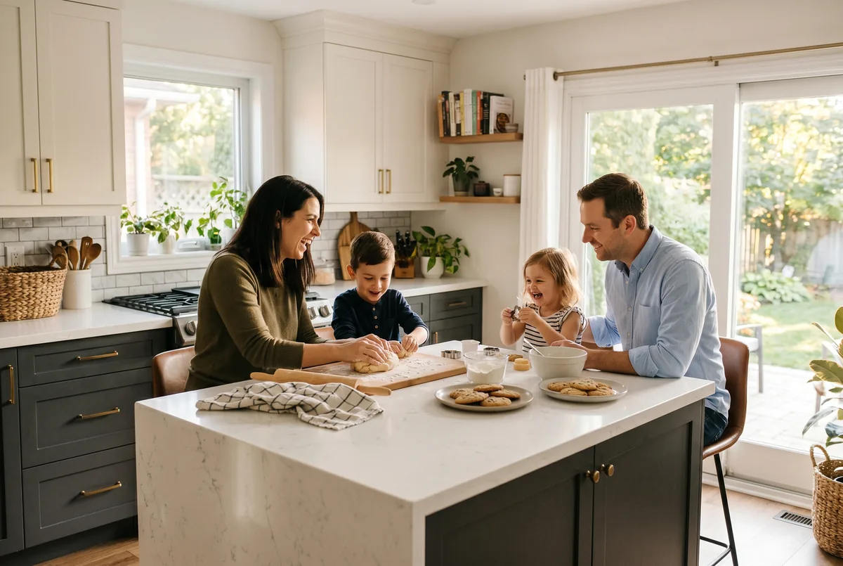
The single biggest difference between a grey kitchen that looks current in 2026 and one that looks like it was designed in 2017 is the use of a second colour. All-grey kitchens are out. Two-tone is the standard now.
The most reliable formula: grey on the lower cabinets and island, warm white or natural wood on the uppers. This breaks up the visual weight of grey, adds warmth at eye level, and makes the kitchen feel less monolithic. Reverse the formula if you have a small kitchen and want the lighter colour grounding the bottom.
The other strong combination is grey perimeter cabinets with a contrasting island. A walnut wood island against soft grey perimeter cabinets is the most-photographed combination in 2026 design magazines. It works because the wood adds organic warmth that flat grey cannot provide on its own.
Pro tip
If you are nervous about committing to two cabinet colours, start with the island. A different colour on the island alone is enough to break up an all-grey kitchen and reads as intentional, not indecisive. Many of the most successful kitchens we deliver in GTA follow this exact pattern.
What Makes a Grey Kitchen Look Dated
If you renovated in 2016 to 2018, your kitchen probably has some of these markers. The good news: most can be updated without ripping out the cabinets. Knowing what trips the dated meter helps you avoid repeating it.
Cool blue-grey on every cabinet. The 2017 grey reads obviously cold under modern LED lighting. If your cabinets have a steely or icy undertone, pairing them with warm wood floors and brass hardware can soften the look without repainting.
Brushed nickel hardware on every door and drawer. Brushed nickel was the default finish for almost a decade. It now reads dated on its own. Replacing pulls and knobs with brushed brass, matte black, or unlacquered brass is one of the cheapest, fastest updates a homeowner can make.
White subway tile with grey grout. Not dated yet, but moving in that direction. If you are renovating now, consider larger format tile, slab quartz backsplashes, or zellige-style handmade tile to feel more current.
Stainless steel appliances with shiny black trim. Panel-ready appliances or appliances with matte finishes are the 2026 alternative. If you are not replacing appliances, pairing them with a strong cabinet colour and warm hardware redirects the eye.
Colours and Finishes That Pair with Grey Cabinets
Grey is forgiving with most secondary materials, but a few combinations consistently look better than others. Lock these in early and the rest of the design becomes much easier.
Floors. Wide-plank engineered hardwood in natural oak or walnut. Avoid red-toned hardwood, which fights with grey. Light grey floors with grey cabinets read flat and washed out. Stone-look porcelain in a warm beige works if you want low-maintenance.
Countertops. White quartz with subtle grey or warm beige veining. Pure white laminate counters are the fastest way to make a grey kitchen look cheap. Marble-look quartz in patterns like Calacatta or Statuario is the safest 2026 pairing. Soapstone is a sophisticated alternative for darker grey schemes.
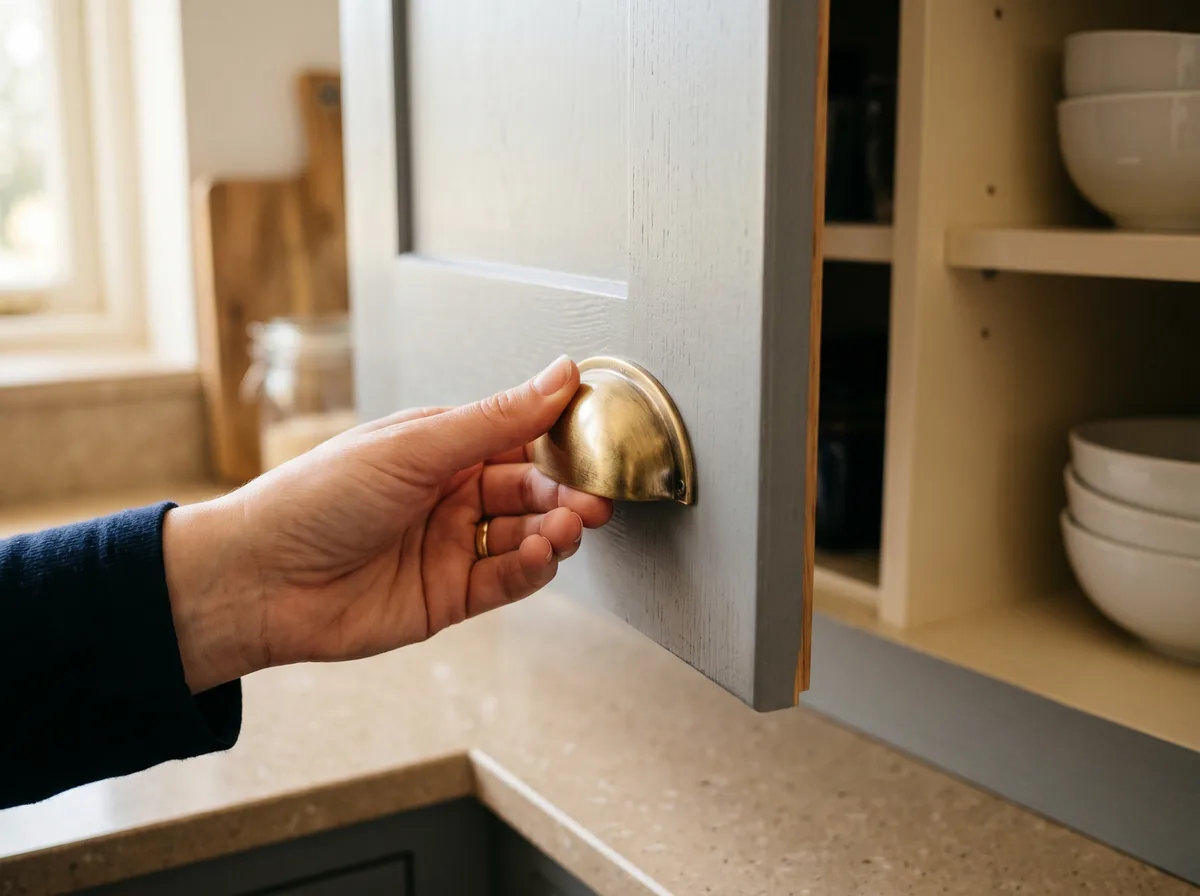
Hardware. Brushed brass, unlacquered brass, or matte black. All three feel current. Polished chrome reads dated. Brass adds warmth that grey lacks. Black adds graphic contrast.
Wall colour. Off-white. Avoid pure white walls with grey cabinets, the contrast feels stark. Warm whites like Benjamin Moore White Dove or Cloud White soften the room without competing.
Free download
Grey cabinet shade selector with pairing tips for floors, hardware, and countertops.
Download the grey cabinet style guide (PDF)A Note on Mississauga Homes Specifically
The Mississauga housing stock leans heavily toward 1970s to 1990s detached and townhouse construction. Many of these homes have natural oak trim, oak staircases, and hardwood that the homeowner does not want to refinish. This affects the grey shade that will work.
If your home has natural oak floors and trim that you are keeping, lean toward warm greige or soft pearl grey on cabinets. A cool slate grey will fight the oak and make both look worse. If you have replaced the floors with engineered hardwood in a more neutral tone, you have more flexibility, including mid-tone slate or charcoal.
Newer Mississauga builds, particularly the 2010s and later condos and townhomes around Square One and Port Credit, often have grey-toned LVP or porcelain flooring. In those, blue-grey or mid-tone slate cabinets work better than warm greige, which can read muddy against cool floors. Match the temperature of the cabinet to the temperature of the floor.
For a deeper look at how Mississauga kitchens are being designed in 2026, see our breakdown of 2026 kitchen trends to look out for and kitchen renovations that actually boost home value.
Sources and References
- National Kitchen and Bath Association – 2026 design trends and homeowner spending research
- Benjamin Moore – cabinet paint and finish reference for 2026 greys
- Houzz Canada – kitchen design photo trends and homeowner project data
A note on this guide
This article is for general guidance only. Costs, products, and design preferences change. Kitchen and Bath Reno is not liable for outcomes from actions taken based on this content. Always confirm finish samples, lighting, and material compatibility with a qualified designer or contractor before signing off on a kitchen renovation.
Frequently Asked Questions
The verdict: Grey kitchen cabinets are still in style for 2026, but only if you commit to the warmer end of the spectrum and pair them with at least one second tone. The kitchens that will look dated by 2030 are the ones that played it safe with cool steel grey on every surface. The ones that will still look current are the ones that treated grey as a foundation, not a finish line. Book a free in-home consultation with our team across Mississauga, Oakville, Burlington, Brampton, Milton, and Georgetown to walk through cabinet samples in your actual lighting before you decide.