People agonise over the tile and then pick the grout colour in ten seconds at the checkout, which is backwards, because grout is the mortar line running through your entire design and it can quietly make or ruin the look. The good news is that choosing it well comes down to three simple strategies, and once you know them the decision gets easy. Whether you are tiling a backsplash, a floor, or a full shower, our bathroom renovation and kitchen renovation teams help GTA homeowners land the right grout colour every week.
This guide walks through why grout colour matters, the three strategies designers actually use, how to choose room by room, and how to keep the colour looking good for years. By the end you will be able to point at a tile and know exactly which grout to reach for.
In this article
Why grout colour matters more than you think
Grout is not a background detail. On a typical wall of subway tile, the grid of grout lines covers a real share of what your eye takes in, and on a mosaic or penny-round floor it can be nearly half the surface. Change the grout from white to charcoal and the exact same tile goes from soft and quiet to bold and architectural. Nothing else in the room shifted, only the lines between the tiles.
That is the power and the trap. The right grout colour makes a modest tile look designed and expensive. The wrong one fights the tile, dates the room, or turns into a cleaning chore you regret every week. Because it is baked in once the installer mixes the batch, grout is not a choice you want to rush.
Did you know?
Grout comes in dozens of shades, and manufacturers publish full colour cards for exactly this reason. Grout maker Mapei alone offers a wide range of coordinated colours plus stain-resistant and epoxy options, so you are never stuck matching to whatever the store happens to stock. Ask your renovator for the colour card and hold the chips against your real tile.
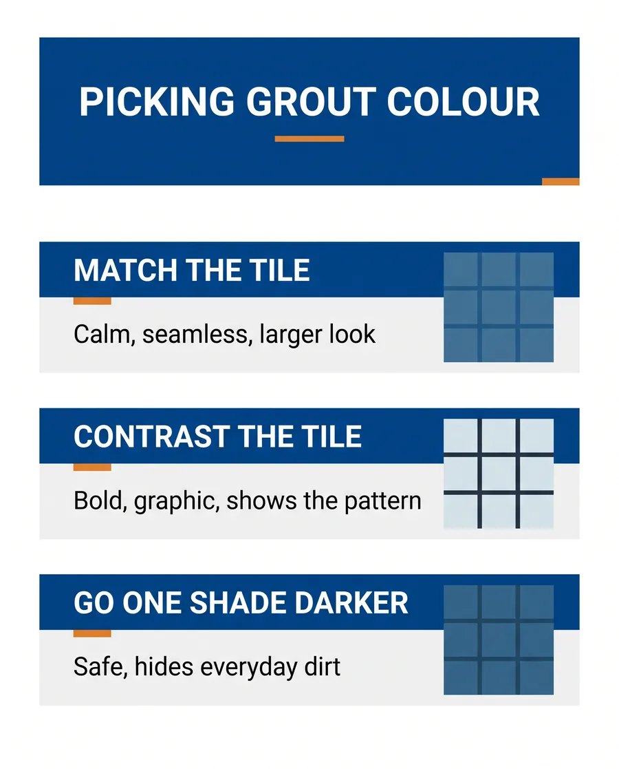
The three grout colour strategies
Almost every good grout decision is one of three moves. Learn these and you can size up any tile in a showroom.
Match the tile for a calm, seamless look
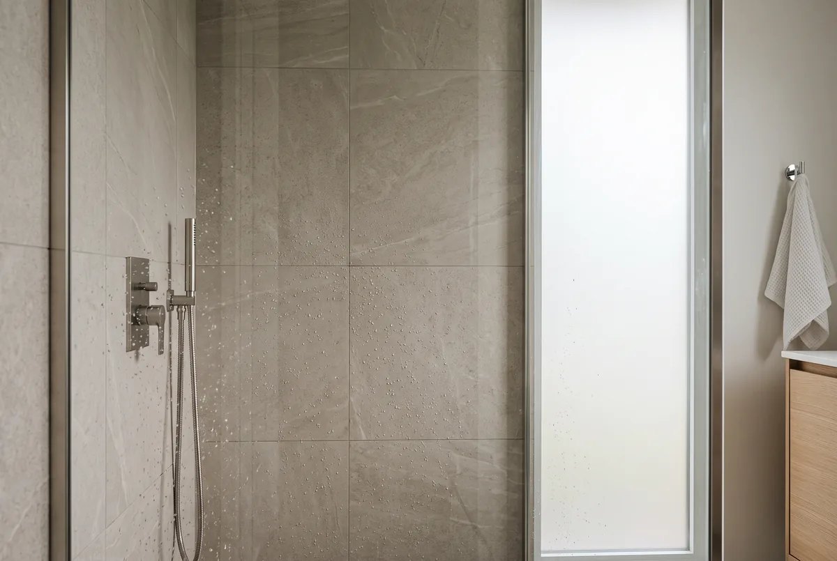
Pick a grout as close to the tile colour as you can. The joints visually disappear, the tile reads as one continuous surface, and the room feels larger and more serene. This is the go-to for large-format tile, for small bathrooms and powder rooms where you want to stretch the space, and for any minimalist look. It is why a greige porcelain shower with matched grout feels so restful.
Contrast the tile to show off the pattern
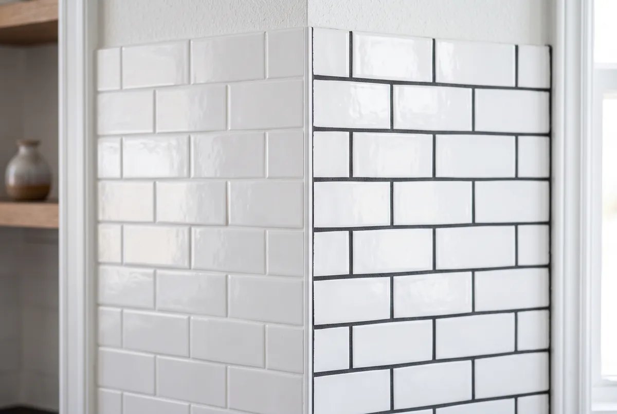
Choose a grout that stands clearly apart from the tile, most famously charcoal grout on white subway tile. Now every tile is outlined, the pattern becomes the feature, and the wall looks graphic and intentional. Contrast rewards a tile worth showing off, like a herringbone lay or a classic subway grid, but it is less forgiving: bright white grout against dark tile will show every speck of dirt.
Go one shade darker when you cannot decide
The safe, always-defensible pick is grout a single shade darker than the tile. You get just enough definition to see the craftsmanship without the hard contrast, and the slightly darker tone hides everyday grime far better than a bright line. When a homeowner is torn, this is the choice we most often steer them toward, because it is very hard to regret.
People often ask: is white grout on a white backsplash a mistake?
Not at all, on a wall. A white-on-white kitchen backsplash looks clean, seamless, and timeless, and walls stay far cleaner than floors, so upkeep is easy. The place white grout gets you in trouble is on the floor, where it shows dirt and yellows over time. Keep bright white for vertical surfaces and step to a mid tone the moment the tile hits the ground.
Choosing grout colour room by room
The three strategies still apply, but the room changes the priorities. Here is how it plays out where GTA homeowners tile most.
Kitchen backsplash
Backsplashes are at eye level and stay relatively clean, so you have freedom. Match white grout to a white tile for a quiet, timeless backdrop that lets your counters and cabinets lead. Or reach for charcoal on white subway tile if you want the backsplash itself to be a design moment. Coordinate with your backsplash tile choice and the counter so the three read as a set.
Kitchen and entry floors
Floors take the abuse, so upkeep wins. A mid grey or greige grout hides crumbs, footprints, and the grey film that builds up in a busy kitchen. Save bright white for the walls. This one rule prevents most of the grout regret we hear about.
Bathrooms and showers
Bathrooms lean toward calm, so matched or one-shade-darker grout suits most vanities and floors. In the shower, moisture and hard water are the deciding factors, which brings us to upkeep.
Staining, upkeep, and when to choose epoxy
Colour is only half the decision. The grout you pick also has to survive the room, and that is largely about the type of grout, not just the shade. Standard cement grout is fine for most walls and dry floors, but it is porous, so it wants sealing and it can stain in wet or high-traffic spots.
For showers, kitchen floors, and anywhere spills and hard water are constant, ask your renovator about stain-resistant or epoxy grout. It holds its colour, resists staining, and shrugs off the mineral residue that plagues our GTA water. It costs more and is fussier to install, so it is a job for a pro, but in a wet area it pays for itself in years of easier cleaning and truer colour.
| Grout colour strategy | The look | Best for | Upkeep |
|---|---|---|---|
| Match the tile | Calm and seamless, tile reads as one surface | Large-format tile, small rooms, minimalist looks | Easy on walls, plan for a mid tone on floors |
| Contrast the tile | Bold and graphic, shows every tile and the pattern | Subway tile, patterned floors, feature walls | Light grout shows dirt, dark grout can fade over time |
| One shade darker | Subtle definition without a hard grid | The safe default when you cannot decide | Forgiving and low maintenance |
Please note: This article is general design guidance only. Grout colours look different under your lighting, and cured grout can shift a shade from the wet sample. Kitchen and Bath Reno is not liable for outcomes from choices made based on this content. Always test your final grout colour against your actual tile, in your own room, before the installer mixes a full batch.
Save your money
Buy one small box of your chosen grout and grout a few spare tiles or an offcut before the installer does the whole room. A ten dollar test batch, cured overnight, tells you exactly how the colour will look dry and in your light. That single step prevents the costly, messy job of tearing out grout you decided you hate.
A quick way to narrow it down
Still on the fence? Run your tile through the finder below to get a strong starting suggestion, then test your top two colours against the real tile before you commit.
Grout colour finder
A starting point only. Always test your top two against the real tile before you commit.
Pro tip
Look at grout samples in the actual room and at the time of day you use it most. A grout that reads warm grey under the showroom’s bright white lights can look almost lilac under a warm kitchen bulb or cool daylight. Hold the chip flat against the tile, step back, and check it morning and evening before you decide.
Download the free grout colour cheat sheet
A one-page reference to bring to the tile shop for your kitchen or bathroom reno.
Grout Colour Cheat Sheet – Free PDFKitchen and Bath Reno tiles kitchens and bathrooms across Mississauga, Oakville, Burlington, Milton, Brampton, and Georgetown, and we bring the grout colour card right to your tile so there are no surprises. If you want a finish that looks designed rather than default, explore our kitchen renovation and bathroom renovation services, or book a free consultation to plan your tile and grout together.
Frequently asked questions
Should grout match or contrast with the tile?
It depends on the effect you want, and both are right in the correct spot. Matching the grout to the tile makes the surface read as one calm, seamless plane, which is why it suits large-format tile and small rooms that you want to feel bigger. Contrasting grout, like charcoal on white subway tile, turns the joints into a graphic grid and celebrates the tile shape. If you cannot decide, the safe middle path is grout one shade darker than the tile: you get gentle definition without committing to a stark contrast, and it hides everyday dirt better than a bright white line.
What grout colour hides dirt the best?
Mid grey and greige are the workhorses for hiding dirt, which is why you see them on so many kitchen and mudroom floors across the GTA. They sit far enough from pure white that crumbs, footprints, and the grey film that builds up over time barely show, and they are dark enough to avoid the yellowing that plagues white floor grout. Very dark grout also hides dirt but can show soap scum and hard-water residue in a bathroom. If low maintenance is your top priority, a mid tone is almost always the smart call.
Is dark grout a good idea in a shower?
Dark grout can look stunning in a shower, but go in with your eyes open. In our hard-water GTA showers, very dark grout tends to show white mineral and soap-scum residue, so it needs regular wiping to stay crisp. It can also lighten unevenly over years of wear. If you love the dark look, ask your renovator about a stain-resistant or epoxy grout, which holds colour better and resists staining in wet areas. A closely matched mid tone is the lower-maintenance route if you would rather not fuss over it.
Can you change grout colour after it is installed?
Yes, within limits. You cannot make dark grout lighter, but a grout colourant or stain can take existing grout darker and refresh tired, patchy lines, and it seals them at the same time. It is a real weekend project and a good mid-life refresh, though the result is not always as flawless as new grout mixed to the right shade. For a full colour change or if the grout is cracking and failing, regrouting is the cleaner fix. This is exactly why testing before install matters so much.
What is the most popular grout colour in 2026?
Soft warm greys and greige lead the way in 2026 because they flatter the natural stone looks, warm woods, and greige porcelain that are everywhere in GTA kitchens and bathrooms right now. On crisp white tile, two looks dominate: a seamless white for a quiet, modern feel, and a bold charcoal for that graphic subway-tile grid. Pure bright white floor grout keeps falling out of favour simply because it is hard to keep clean. When in doubt, a warm mid grey is the colour most homeowners are happy with a year later.